What is an X-bar Control Chart?
What is an X-bar Chart?
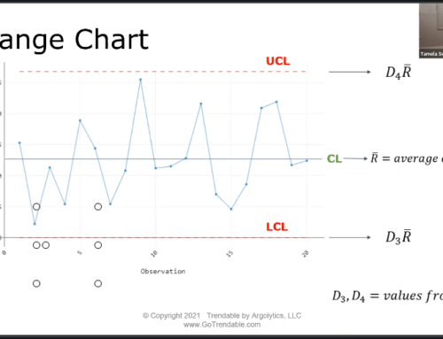
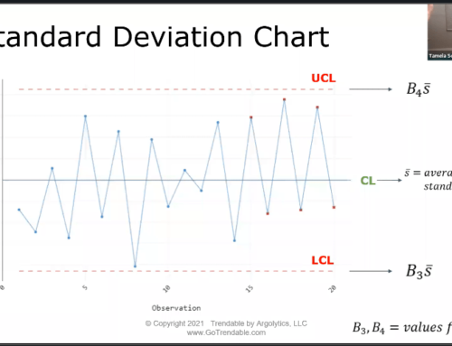
X-bar charts plot the mean of each subgroup in time order. Rational subgrouping is done wherein the samples in each subgroup are produced under the same conditions, minimizing the variation between each sample and allowing us to focus on the variation between subgroups. Either an R-chart or S-chart are used to assess within subgroup variation, depending on the subgroup size of the samples. Subgroup size is typically, but not necessarily, consistent across all subgroups. The centerline is the average of all subgroup means. The control limits are set at a distance of three standard deviations above and below the center line.
How do I make an X-bar Chart with TRENDABLE for Data Analysis?
- Upload your data to Trendable for Data Analysis.
- Create/Select specification limits specific to the data.*
- Review the results.
- Export the final report to Microsoft Word.
*Note: When the chosen specification limit subgroup size is greater than one, Trendable for Data Analysis automatically displays an X-bar Control Chart in the report.
