What is a Range Control Chart (R-Chart)?
in TRENDABLE for Data Analysis
What is a Range Chart?
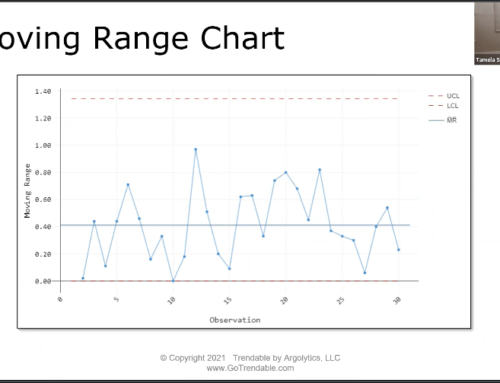
The Range or R-Chart is used together with the X-bar chart to evaluate process variation. The R chart plots the difference between the minimum and maximum value in each subgroup in time order. The R control chart is appropriate for assessing within subgroup variation when the size of the subgroups is between two (2) and eight (8). The centerline for the R chart is the average of all ranges. The control limits are set at a distance of three standard deviations above and below the center line.
How do I make an R-Chart with TRENDABLE for Data Analysis?
- Upload your data to Trendable for Data Analysis.
- Create/Select specification limits specific to the data.*
- Review the results.
- Select “Add Chart” and choose Range Chart.*
- Export the final report to Microsoft Word.
*Note: When the chosen specification limit subgroup size is between 2 and 8, Trendable for Data Analysis automatically displays a Range Chart when the “range chart” is added.
