Top 5 SPC Control Charts

Control charts are fundamental to quality control analysis. As one of the simplest statistical tools, they provide a visual representation of how well a process is performing by comparing a sample of its products to the calculated control limits. Control limits are determined based on the variation inherent in the process. Analyzing the trends and the behavior of the observed process via the control chart allows for further investigation of anomalies or “special cause” variation.
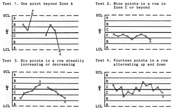
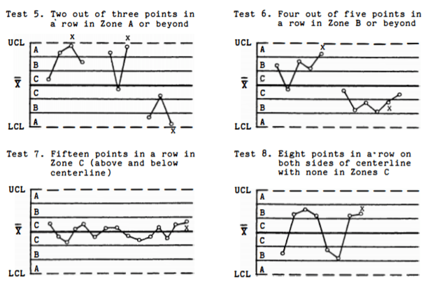
Common-cause variation is inherent and natural in any process, but it is important to be able to identify whether any special-cause variation occurs in addition to it. Special causes of variation are resulted from external factors such as operator performance, defects, and machine error. This type of variation leads to an unpredictable, out-of-control process in which the specification of the products is inconsistent and possesses reduced quality. If a control chart shows data points that exceed the specification limits and/or show a non-random pattern, special-cause variation is present and must be eliminated to achieve a stable process. Shewhart’s eight Tests for Special Causes (Nelson, Lloyd S. “The Shewhart control chart—tests for special causes.” Journal of quality technology 16.4 (1984): 237-239.) are available to help detect the presence of special-cause variation in the process:
There are five essential control charts used to analyze continuous variables (e.g. temperature, time, and distance): range (R), standard deviation (S), moving range (MR), mean (X-bar), and individuals (I) charts. Let’s take a look at when and how to use them:
#4 and #5: Control Charts of the Range (R) and Standard Deviation (S)
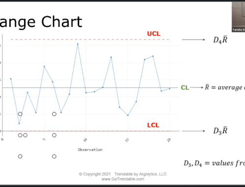
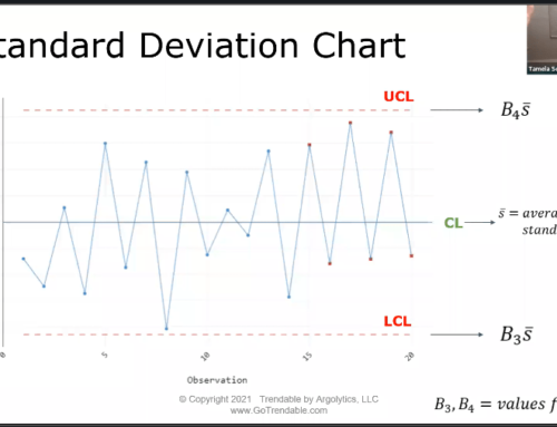
The Range (R) and Standard Deviation (S) control charts are typically used together with the X-bar chart (See Control Chart #2) to evaluate process variation. When using these pairs of control charts, the R or S chart must show stability before analyzing the X-bar chart. The S control chart should be used if the size of the subgroups is larger than 8 because a larger sample size is required to calculate standard deviation more accurately. The R control chart can be used for a subgroup size less than 8. The centerlines for the R chart and the S chart are the average of all ranges and the average of all standard deviations, respectively. Figure 1 illustrates an R control chart for a dataset of 100 samples with subgroup size of 5, and Figure 2 shows an S control chart for 200 samples with subgroup size of 10.
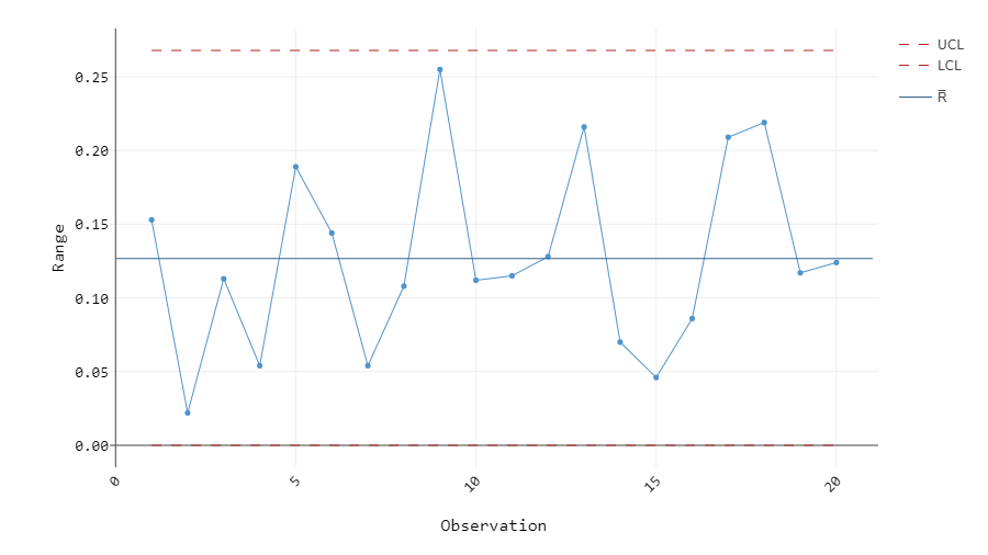
Figure 1: R chart of 100 samples, subgroup size 5
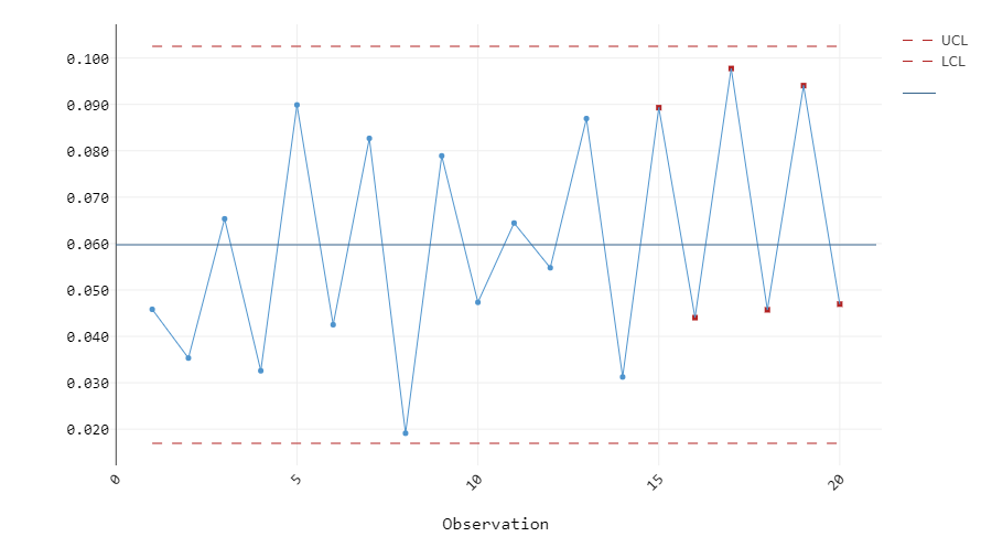
Figure 2: S chart of 200 samples, subgroup size 10
Shewhart’s Tests for Special Causes 1, 2, 3, and 4 are available for these charts. At a quick glance, the R chart in Figure 1 seems to have a random pattern and none of its plots exceed the upper and lower control limits. The four tests can confirm these observations, and we can proceed to assessing the X-bar chart. On the other hand, the S chart in Figure 2 shows several plots marked in red, indicating that they failed one or more Tests for Special Causes. Based on the pattern in the S chart, this dataset most likely fails Test 4 due to its cyclic nature. Therefore, this process must be investigated further to eliminate any special-cause variation before repeating the analysis and moving on to the X-bar chart.
#3: Control Chart of the Moving Range (MR Chart)
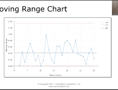
The Moving Range (MR) chart helps to assess process variation by taking the absolute difference between consecutive observations. It is typically paired with the individuals (I) chart (See Control Chart #1) as the “I-MR Chart”. The MR Chart is used to see if the variation between two consecutive data points is unnatural, and to determine the data points wherein the special-cause variation may be present. Because of that, it is important that the observations are recorded in time order. Unlike the R and S charts, it is only used when the size of the subgroup is 1 and it works for a smaller sample size. The centerline is the average value of all moving ranges. Figure 3 provides an example of an MR chart for a dataset of 100 samples with subgroup size of 1.
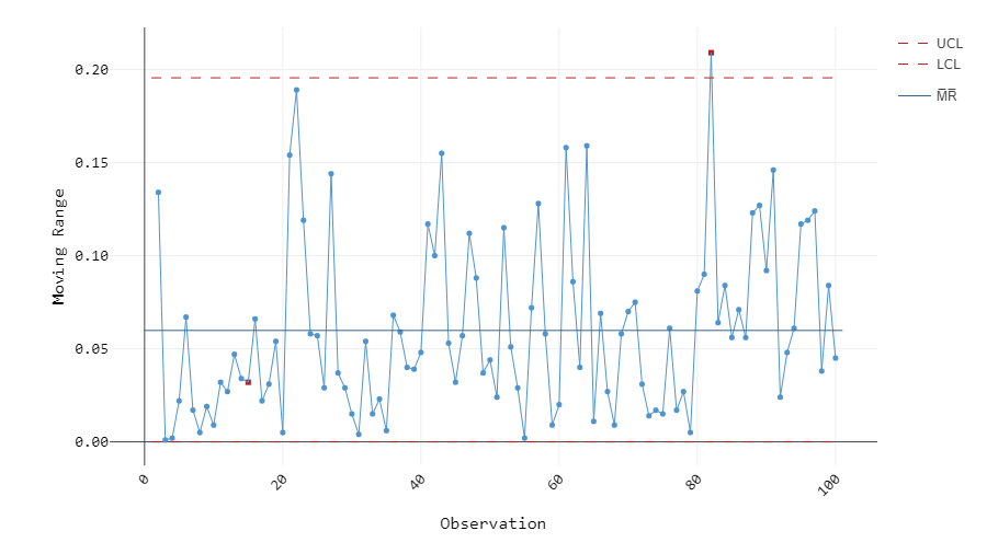
Figure 3: MR chart of 100 samples, subgroup size 1
The MR chart in Figure 3 has two data points marked in red. This means that the process is unstable and the two red plots must be investigated to identify special-cause variation that occurred between the consecutive observations.
#2: Control Chart of the Mean (X-Bar Chart)
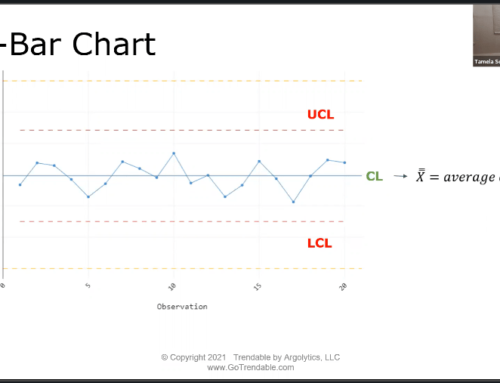
X-bar charts are paired with either R or S chart, depending on the subgroup size of the samples. Rational subgrouping is done wherein the samples in each subgroup are produced under the same conditions, minimizing the variation between each sample and allowing us to focus on the variation between subgroups. Subgroup size is typically, but not necessarily, consistent across all subgroups. The mean of each subgroup is then calculated and plotted on the X-bar chart. Thus, the centerline is the average of all subgroup means. Figure 4 is an example of an X-bar chart for the same dataset used in Figure 1.
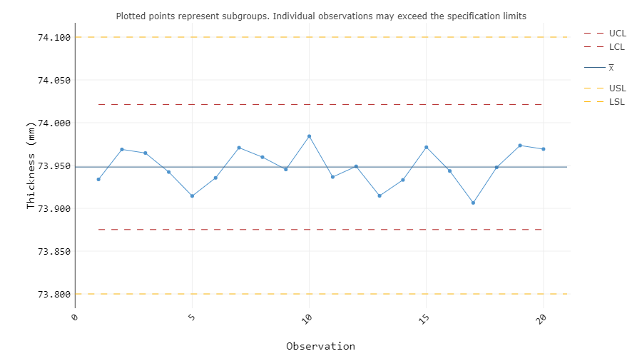
Figure 4: X-bar chart of 100 samples, subgroup size 5
All eight Tests for Special Causes are applicable to the X-bar chart, but using all of them may result in false positives. Only Test 1 is used if the process stability is unknown. Since the R chart for this dataset (Figure 1) suggests that the observed process is stable, Shewhart’s Tests for Special Causes 1, 2, and 7 are typically applied. The X-bar chart in Figure 4 passes these tests, indicating that there is no special-cause variation affecting the mean values of the subgroups.
#1: Control Chart of Individual Values (I Chart)
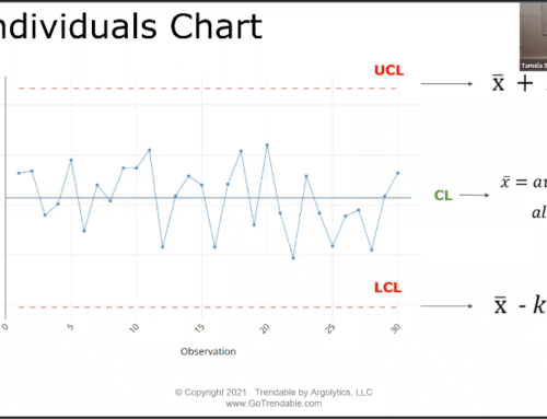
The last control chart on this list is the simplest and most commonly used control chart today, the Individuals or I chart. Each recorded observation is plotted on the chart in time order to evaluate the variation between consecutive samples, which is why it is often paired with the MR chart. The centerline is simply the average of all observed values, and the control limits are ±3 standard deviations from the average. Figure 5 shows the I chart for the same dataset used in Figure 3.
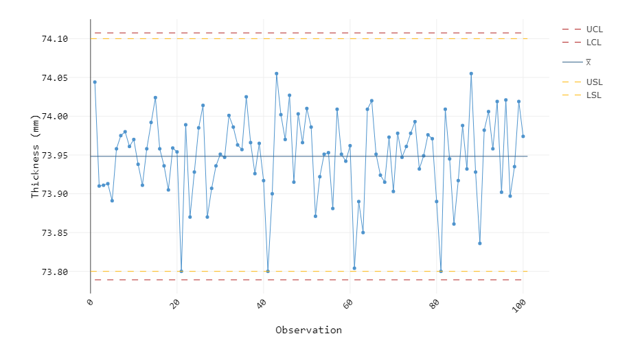
Figure 5: I chart of 100 samples
Although all the data points in Figure 5 are within the control limits, we can observe that there are more data points closer to the lower control limit than there are closer to the upper control limit. This indicates that the process may not actually be stable, as suggested by the MR chart in Figure 3. This situation demonstrates the importance of analyzing the R, S, and MR charts first and eliminating any special-cause variation before looking into the X-bar or I chart which does not tell the whole story.
Key Takeaways
In quality control analysis, control charts are essential to understand how a process is performing. Are external factors affecting the process variation? Is the process stable? Are the products meeting customer requirements? These are just some questions that can be answered by analyzing control charts.
There are five commonly used control charts for continuous variables: range (R), standard deviation (S), moving range (MR), mean (X-bar), and individuals (I) charts. The X-bar chart is generally paired with either R or S chart, and the I chart is often paired with the MR chart. All of these charts have their own uses and techniques, so it is important to know when and how to use them based on the dataset and the process. There are eight Tests for Special Causes you can use to determine if special-cause variation is present. Statistical software like TRENDABLE for Data Analysis makes this process easier by indicating any failed tests with a red plotted point.
Author
Michelle Soeganto is the author of this article. Learn more about the Argolytics team here.

